Wednesday, 31 March 2010
Monday, 29 March 2010


Planning Photo's For Magazine Cover And Poster


These were my planning photos at the beggining, I zoomed in and cropped photos when editing these. I took a range of different shots as i wanted to see which ones would look more frightening. However i found whilst editing the simpelest photos such as the one just above, was more useful as i used the lighting red from photoshop to be used on the phtograph.
Wednesday, 24 March 2010
Fonts that can be used on my Magazine Cover or Poster
 These were some of the fonts that I found on the internet to use on my poster/Magazine cover. I would edit one of these on photoshop and will be used in my final product.
Headings for Magazine cover- (Masthead)
 These were my first ideas for a magazine masthead, as i thought it should relate to theme of horror. However looking at more magazine covers relating to advertising a movie, they were more related to mastheads that had the idea of a film in it, so I cam up with other names.ie:
Film View
Take One
Film Camera Action
In the end I picked Film View as the masthead on my magazine.
Colour Schemes that can be used for my Magazine and Poster
Colour schemes are used to create style and appeal. A basic colour scheme will use two colours’ that look appealing together. More advanced color schemes have three colors in combination, usually based around a single colour; for example, text with such colours as red, yellow, orange and light blue arranged together on a black background in a magazine article.
Colour schemes can also contain different shades of a single colour; for example, a colour scheme that mixes different shades of green, ranging from very light (almost white) to very dark.


These are the colours formed by mixing a primary and a secondary colour. That's why the hue is a two word name, such as blue-green, red-violet, and yellow-orange.

Flatplans for Poster Cover

Analysis of Jaws Magazine Cover

Layout- The layout consists of most of the writing being put on the left third of the magazine. This is because, usually we automatically read from the left hand side hence most of the information is put there. So you could argue that the significant information is placed on the left third, i.e the mast head and most of the cover lines. Also there is only one or two cover lines placed on top of the image. This could be due to the significance of the image. The image of the shark and the woman inside the shark is placed within the centre of the magazine. The reason for this is so that the audience can see what is happening in the image clearly i.e. she’s in the shark’s mouth. Although, written faintly on top of the image is the website related to the magazine. This is so that the audience can find more information about the magazine and this relates back to the jaws on the image of the shark as well. It is written across the image however its very faintly written contrasted against the bold colours on
the image.
Photograph The photograph is an image of a shark eating a woman. The shark is not fully seen though we can only see the top half and beneath the shark. Therefore we get a good view of its jaws and teeth. This is significant as the titles name is ‘jaws’ and this in turn symbolises and illustrates what the masthead is already saying. Also there is a lot of blood this is coming from the woman that has been eaten by the shark. This is significant as it is an convention of horror movies.
Masthead- The masthead is written in red and in bold to demonstrate its importance on the magazine. Also ‘Jaws’ is the only word that is written in the biggest font again demonstrating how prominent it is supposed to be on the magazine.
Representation- The photo represents horror through the visual imagery of blood and a woman panicking. Blood usually indicates the idea of gore which reflects the theme of horror. Also the colour red suggests danger, alertness and violence. This is significant as this all reflects the idea of panic and fear which is a convention of horror. The shark is represented as the big terrifying attacker, by the use of its teeth being very sharp and large. This is important as the shark helps create the fear and scares the audience. This is vital as this is exactly what a horror movie should do.
Typeface: There are various fonts used on the magazine. The masthead looks bubblier than the rest of the writing on the magazine cover. This could be because the masthead should look more different as it is the company’s name and needs to attract the audience. Another feature on the magazine that helps enables it to look more attractive is the colour red used on the title. It matches the blood around the whole photograph and also it has connotations of alertness and danger. This is significant as red is very bold and alerting, therefore addressing the audience simply through colour. Other writing on the magazine cover is straight, narrow and sharp. This is so that the audience can read the writing clearly and its different font in comparison to the masthead. Also the font used on the magazine cover is much smaller than the masthead right at the top, portraying the significance of the masthead as opposed to all the other writing on the magazine.
Denotation and connotation: On the front cover there is an image of a shark and a woman. The idea of this is so that the shark represents an attacker and the woman represents the defenceless. This is significant as these are the main types of characters in a horror movie. The ocean is then shown, which helps portray the idea of fear as the woman is stuck in the water with her blood everywhere. This shows her as helpless and makes the audience feel uncomfortable and uneasy. This is so that the idea of horror and gore is demonstrated and the audience get an idea of how they may feel when watching the movie. This is significant as the whole point of horror movies are suppose to be terrifying and scary and this is exactly what the photo illustrates. Also we only see the top half of the woman as the rest of her body is swallowed by the shark. Instead we can see the shark’s teeth and that’s mainly what the audience can see of the shark. This is so that we can see how brutal and horrific the shark actually is. The shark’s teeth look very large and sharp, indicating how much pain the woman maybe in. This reinforces the idea that the photo is trying to emphasise the movie is based on horror. Also across the image is the website of the company, suggesting that it is more significant than the image and may have more information about the image.
Colours and Meaning: The prominent colours are black, red and yellow. Black usually reflects darkness, anonymity and has generally negative connotation. This colour is used as the background behind the image of the shark and on some writing at the bottom of the magazine. This could be, to show that the audience that the film does contain ambiguity and also to show that there is negative scenes such as the one portrayed on the front cover. Red suggests danger, violence and blood. This is used on the writing and the picture as well to portray the idea that the horror movie includes danger and blood. This is significant as these are conventions of a horror movie. Yellow indicates brightness and is usually associated with the sun. This suggests that yellow is very effective for attracting attention and therefore highlights important features inside the magazine on the cover lines.
Analysis of Empire Magazone cover
 Colours and Meaning: The prominent colours used are white, green and purple. Green is usually associated with nature and safety. Green is used to introduce the character on the magazine, as a background colour for a flash button. This could be, because it allows the audience to feel more comfortable with new ideas and actors put on the front cover. Purple is used as a line in the background, which looks a lot like spray paint. Purple usually represents nobility and spirituality. This can compliment green as green represents peace and purple represents spirituality. White is used to write the rest of the cover lines which contrasts against the dark background. This maybe because white makes the writing stand out more clearly against a darker background. This is significant as the audience can read the writing more clearly and then will be able to see what types of features are inside the magazine. Also the man on the front cover is wearing green, the writing on the magazine that written in green maybe written in that colour to match the clothes on the man.
 The masthead: The masthead is written in a straight, sharp sort of font. This is because horror movies are usually serious, terrifying and are suppose to build tension. By using a sharp edged font, this helps create those conventions of horror. Also the masthead is covered by the image in from of it. This could be, because the magazine is that well known, that the masthead doesn’t need to be seen clearly. Also it could be because the image is more significant and needs to be seen more clearly than the masthead as well. However it is written in red. This colour represents powerful emotions of anger and passion. This is important as this colour enables the masthead to alert people of what the magazine company is.
Representation: The photograph portrays a man sitting down looking downwards towards the camera. This portrays the man’s power due to the idea that even though he is sitting down, he still has the power to look down at the audience. Usually the representation of men is quite dominant and they may an instrumental role as a breadwinner. This is significant as this is exactly what is represented in the photograph. Also the man’s clothes are quite smart representing a smart, businesslike man. However this is contradicted with his face which is painted with makeup which represents femininity and gives an idea that he’s a fictional character in the film.
The Layout: The layout is quite chaotic as there are a lot of flash buttons, cover lines spread across the page. One main image is put on the front cover that is also placed on top of the masthead. This could be due to the significance of how the image relates to the cover lines, the movie that is featured in this magazine and also the fact that it’s a main character that’s in the movie. This is significant as a particular audience maybe attracted to this magazine due to their favourite actor is featured on the magazine.
‘Meet the Joker’ is placed on the left hand side as a cover line. This could be due to the fact that people usually read from left to right, so immediately we read this first before we read any other cover line. This is significant as the actual cover line is representing the image on the page. Other cover lines are put on the right. This maybe to show that there is a lot in the magazine. It could also be done to show how different the magazine is, so they don’t use the conventional layout of everything being read from the left.
Connotation and Denotation : On the magazine, right at the top there is a sentence that immediately states that the magazine is exclusive and introduces the film as well in which the character on the front cover plays a part in. This is so that the audience knows exactly what the magazine has as its main feature and why there is an actor on the front cover of this magazine. The masthead is written in red and is put behind the image that is below it. The reason for the masthead put in red, could be because the masthead is suppose to look different from all the other writing on the magazine. Also red usually suggests alertness. This is significant as this alerts readers about what magazine they are reading. Then the image being put behind the photograph demonstrates how well known the magazine is, to the extent that the title doesn’t need to be seen that clearly. Also, it could be, because the image represents the biggest feature on the magazine, therefore the size of the photo symbolises this. The photograph is of one of the main characters in the film which is stated write at the top .i.e. ’The Dark Knight’. The photograph shows a man sitting down looking downwards towards the camera. This portrays the man’s strength, power and dominance due to the idea that even though he is sitting down, he still has the ability to look down at the audience. Men usually play an instrumental role as a breadwinner. This is significant as this is exactly what is represented in the photograph. Also the man’s clothes are quite smart representing a smart, businesslike man. Again this adds to the usual assumption of the man being the breadwinner. However this is contradicted with his face which is painted with makeup which represents femininity and gives an idea that he’s a fictional character in the film. However his character is the joker and he has to wear makeup as it is apart of his costume and characters identity. The only cover line that is written on the left hand side is the cover line that explains the feature of the film. This could be because people usually read from the left to right. Also this is the main feature therefore it’s the only cover line that’s written there to show its significance. The rest of the cover lines are written on the right hanside, this maybe because they are other features in the magazine which are not as significant as the main feature. The cover line that is written on the left is written there to explain the image behind it as well, so it’s placed more above as opposed to the other cover lines that are written towards the bottom. Also the barcode, price and the date is put on the bottom left. The barcode may have been put on the left, so that when paying for the magazine, it’s easier for the sales person to find the barcode. Also the price and the date maybe put on the left, because these are details that vital when a consumer would need, when purchasing something.
Comparing and Contrasting Posters
A major similarity between Blair Witch, Saw 2 and Final Destination is that they all have a large image that takes the centre of the page. It also is a very significant aspect to the film, or gives a big clue as to what the film is about. This is because images usually attract an audiences attention, so that is why the main focus is usually on the image. Also the image is never explained in any of the posters. This indicates that all the posters suggest enigma and ambiguity, which is a vital convention in horror movies.
Although the obvious difference between the images is what is actually put as an image on the poster. All the movies are different even though they are the same genre. So the posters have an image that is specific and that can create suspense within that particular movie.
The layouts of the images and where the writing around the poster is usually similar.ie the details of the movie are right at the bottom, the image takes up the centre of the page and the title may be above or below the image. However there are minor differences between the layouts ie.on the Saw 2 poster the image is put to the left hand side and then it is jet black on the right handside. This maybe because of the idea that the audience will automatically read from left to the right therefore instead of placing writing there, they place an image which is very significant to the film. This suggests the idea of ambiguity as we don't know why that image of a puppet like figure is put there, however when you see the movie you realise it plays a big part within the plot. Whereas in Blair Witch there is writing placed right at the top, which none of the other posters have, it includes a brief paragraph of what the movie is about. This could be, because the image has trees in the background and half an image of a face, and it comes across as too ambiguous so the audience may get unintreasted. Therefore they have decided to put a paragraph of what the movie contains. This then will reassure the audience that the movie is entertaining, moreover, attracting them to watch the movie. Final Destination and Blair Witch are more similar as their images take the centre of the stage and is behind writing thats written on top of the image, suggesting the importance of the writing. Although in Blair Witch and Saw 2 there is all the details such as actors, producers, directors names and the website all written at the bottom, unlike Final Destination that only has the masthead, (title of the movie), at the bottom. Final Destination has a more plain layout in comparison to Blair Witch and Saw 2, which looks more chaotic due to the colours and writing written on them.
The colours used in saw 2 are the most brightest in comparison to Final Destiantion and Blair Witch. This is due to the fact it uses red and a pale type of yellow mixed with white. Whereas Blair Witch and Final Destination use darker colours such as black and blue. This could be, because they want to create more enigma, whereas Saw 2 makes the image look more attractive by using an alarming colour such as red. However one colour that is used in all 3 is black, this is because it creates suspense and annoymity, which suggests the conventions of a horror movie.
Saw 2 and Final Destination both seem to have a terrifying type of face, that relates to the theme of horror. Wheras Blair Witch has done the complete opposite as it doesn't use the killer or a frightening image to take the centre of the poster, instead is has used the setting of the movie and the fear in someones face to show how scary the movie is. Blair Witch has actually used the opposite approach, instead of using what is scary in the movie like Saw 2 and Final Destion has, they have used the surroundings and what the normal people in the movie deal with, to attract an audience. This is significant as even though nothing terrifying is shown on the poster, it still has created a sense of ambiguity therefore reinforcing the idea of horror and suspense. Saw 2 and Final Destination on the other hand have actually used what is frightening in the movie and therefore portrayed the obvious conventions of horror.
Analysis of Final Destination Poster
 Colour and Meaning: Most of the colour used is black. This could be because black usually reflects darkness, anonymity and has generally negative connotation. This colour is used as the background behind the image of some sort of skull. This is so that the obvious convention of horror is portrayed to the audience, simply through the use of black. White is used on the writing, this could be because the white contrasts with the black background and stands out more against it. This is vital for the audience to see what the writing says clearly. Also red is right at the bottom. Red is a strong colour that suggests powerful emotions of passion and anger. This is used to alert the significance of the information written right at the bottom. Even though the information is right at the bottom, the use of the colour allows the audience to understand the importance of this colour.
Media Language:The writing on the poster is formal; this is done so that the movie can appeal to an older generation as well as a younger one. It could also be formal because it wants to demonstrate the clarity of what’s the movie is about. Although right at the top it says ‘rest in pieces’ which is grammatically incorrect. However the reason for this is because it symbolises what happens in the movie and how people end up dead. Also it can be used to represent the picture of what looks like a skull in pieces.
Layout: The layout of the poster includes the title at the bottom. This is so that the audience can see the image as the first attraction. Once the audience is drawn in then they will notice the title that is written more boldly at the bottom in white. The main image of what looks like a skull takes up the centre of the page. This is because the audience will be mainly attracted to images that are meaningful. This image is distorted; therefore attention to detail is very important. This could be another reason why it’s in the centre, why the image is large and is the only image put on the poster. There’s a little bit of writing at the top, which suggests that it is significant to the poster.
Target audience: The target audience is 18 year olds and above. This is due to the fact that scenes maybe unsuitable for those who are underage.ie violence. Also it appeals to an older generation due to the fact that the writing across the poster is all formal and doesn’t use slang that would be more appropriate for a younger audience.
Typeface: The typeface is small right at the top where it says ‘rest in pieces’ and it’s the same size at the bottom where it says ‘August’. This is because it’s less significant as the rest of the features on the poster .i.e. the image and the title. The title is a much bigger font to symbolise its importance. The title is written in white so that it contrasts with the black background. This is so that the audience can see the writing clearly, again representing its importance. ‘August’ is written in red, which indicates danger and alertness. This is so that the audience can see which month the film is released.
Denotation And Connotation: At the top, it says ‘rest in pieces’. This could be, because it resembles the image below which is in pieces and also what happens in the movie.ie people dieing and how they die. Also the writing is written in white. White usually indicates purity and cleanliness. This is important as this is completely different from the meaning of what is actually written i.e. ‘rest in pieces’ is an actual metaphor for death (people dieing and their body is left in pieces). The image below the writing is what looks like someone’s face shattered in to pieces which also look like glass and the face appears to look like a skeleton. The face is in white and the teeth are coming out of its face which also helps resemble a skeleton. This is done so that it illustrates the theme of death within the movie. The white face is contrasted with the black background. Black indicates signs of anonymity and the unknown. This is important as enigma and ambiguity are conventions of horror movies and are needed to create suspense in the movie. Then at the bottom it says ‘Final Destination’ in white. This is written at the bottom due to the fact that people maybe more attracted to the image than writing. Also it is written quite boldly in white to demonstrate the significance of it as it is the title of the movie. Right at the bottom it has the month of when the movie being released right at the bottom. It’s right at the bottom because the above features are more like to attract an audience.ie image and the title of the movie. However it’s still written in red. This usually represents alertness and danger. This is so that the time of when the movie was released is clearly shown to the audience and they can attract a big audience on the release date.
Tuesday, 23 March 2010
Analysis of Saw Poster
 Colour and Meaning: The prominent colours used are red, black and white. Black is usually associated with the midnight and the unknown. This is vital as it reflects the genre of the movie, which is horror. Also white has connotations of purity and cleanliness. On the title, black is mixed with the white. This could be, because it signifys the plot of what seems innocent.ie. The white, will eventually turn in to something gruesome and horrific i.e. the black. Red generally resembles danger, violence, and emergency and usually is associated with the devil. It’s used on the image of the puppet figure, on places such as, its eye, on the figure’s cheek, the lips and its clothes. This is important as it demonstrates that this figure is representing danger or can be some source of violence within the movie. This is true as the killer in the movie is only seen as some sort of puppet which is featured on the poster. Also red is used below the title ‘saw 2’ and it’s contrasted with white writing that says ‘oh yes…There will be blood’. This is significant as blood is actually red therefore the colour compliments the writing.
Media Language:
The writing on the poster is formal, this is could be due to the idea that the film want to attract an older generation. This is because of the age restrictions on this movie, which is 18 and above.
Layout and Conventions:The layout of the poster includes a large image of a puppet figure that takes up the left and side of the page. However the right hand side of the poster has a black background on the top half. This is because usually the audience reads from the left therefore automatically looks at the image straight away. This could be used as the first thing the audience sees, because this is the main character in the film and plays a prominent role in it. The title of the film is then place right underneath the image of the puppet. This could be because the mage is more important than the name of the film. This could be due to the fact it’s the second sequel of the film therefore the film has already gained an audience from the 1st movie. Also once the image is seen, the audience should know straight away what the film it is, because of the first movie gaining an audience. Although the title is still written largely at the bottom for those who may have not seen the first movie. All the other details of the movie such as the credits, actors, and website are all place underneath the title. This could be because it is less significant than the image and the title.
Typeface: The typeface is small in areas where it is not significant .i.e. actor’s names, credits. Although the typeface for the title is much bigger and the letters are quite separate from each other signifying the importance of the name of the film. This is done so that the audience reads the main features of the film .i.e. the title as opposed to other features of the film that may not be as important to the audience. The writing is all in white except the website that’s in red. This points out the website so that if the audience wishes to find out more information about the movie then they are able to do this through going on the website.
Connotation and Denotation: On the poster there is a picture of a large image of a puppet figure that takes up the left hand side of the page. It has a spiral on the puppet’s cheek that’s in red. Red usually is a sign of danger, this could demonstrate that the puppet is dangerous n the movie. Also the puppet being placed on the left hand side suggests that the puppet is significant in the movie as people usually read from left to right. Red is contrasted with white on the puppets face. However the white looks tainted with a hint of yellow, indicating the puppet is old or has lost its colour. Also white usually symbolises purity and cleanliness, however without the puppet having pure white painted on it, it demonstrates that the puppet is the opposite of all these things. Then on the right hand side of the puppets face, the poster gets darker and it’s all black until it gets to the masthead (title of the movie) at the bottom. The masthead at the bottom is in white writing that looks jagged and looks like it is sketched. This could be because white usually symbolises purity and cleanliness. However the jagged and sketchy font makes the white on the font look broken, therefore symbolises the fact that movie actually does not have themes of purity. Below the title of the movie, there is another sentence that says ‘oh yes….there will be blood’. This demonstrates the obvious conventions of a horror movie.ie blood and violence. Underneath this are the actors’ names, logos, Production Company, director and producer names and all the people behind the scenes and the date of the movie in which it’s released. The date is written in capitals to emphasise when the movie is released therefore knowing when to be at the cinemas.
Anlaysis of Blair Witch Poster
 Colour and Meaning: Most of the colour used is black. This could be because black usually reflects darkness, anonymity and has generally negative connotation. This colour is used as the background behind the image of the person and the forest image is dark as well. This is so that the obvious convention of horror is portrayed to the audience, simply through the use of black. White is used on the writing, this could be because the white contrasts with the black background and stands out more against it. This is vital for the audience to see what the writing says clearly.
Media Language: The writing on the poster is formal; this is done so that the movie can appeal to an older generation as well as a younger one. It could also be formal because it wants to demonstrate the clarity of what’s the movie is about.
Layout: The layout of the poster includes the title at the bottom. This is so that the audience can see the image and the paragraph as the first attraction. Once the audience is drawn in then they will notice the title that is written more boldly at the bottom. A main image is used above the title with a setting behind it. This image is used at the bottom to demonstrate ambiguity .i.e. the image is of half a persons face, only showing their eyes. However it does portray fear and we don’t get to see the expression of their face. This is so that the audience is left in suspense and need to go see the movie to find out what’s happened. Also the paragraph that talks about the actual movie is placed in the centre.
Typeface: The typeface is small in areas where it is not significant .i.e. actor’s names, credits and there’s a small paragraph which tells you about the movie. Although the typeface for the title is much bigger and the letters are quite separate from each other signifying the importance of the name of the film. This is done so that the audience reads the main features of the film .i.e. the title as opposed to other features of the film that may not be as important to the audience. The writing is all in white except the website that’s in red. This points out the website so that if the audience wishes to find out more information about the movie then they are able to do this through going on the website
Target audience: The target audience is 18 year olds and above. This is due to the fact that scenes maybe unsuitable for those who are underage.ie violence. Also it appeals to an older generation due to the fact that the writing across the poster is all formal and doesn’t use slang that would be more appropriate for a younger audience.
Denotation And Connotation: The whole picture is filled with black except where there is a face and where there is a setting of trees. This could be because it represents the anonymity of the film and the suspense of the plot which is hidden within the darkness. The trees right at the top of the poster is used to point out the setting of the movie. Also a lot of trees in the darkness with no leaves may signify themes of isolation and a mysterious atmosphere. These are all important as they all portray obvious conventions of a horror movie. Then in the middle there’s white writing and a red symbol above it. The writing maybe in white so that it contrasts with the black background. This could be so that the audience can read the writing clearly against the black background; in turn this suggests that this paragraph of writing is important as it is placed in the middle as well. This bit of writing tells the audience what exactly the movie will be about without revealing the plot. Again it is significant because this attracts a specific audience that enjoys this genre of movie. The red symbol above could be some sort of sign to represent the movie or something that occurs in the movie. To find out what it means, the audience needs to go watch the movie. The symbol creates suspense because it has not been explained and its coloured in red. This colour reflects elements of danger, blood .etc. Therefore representing the genre of horror once again. Then a person’s face is at the bottom, however you can only see their eyes, nose and a hat their wearing. This is done so that suspense is created as we don’t know who this character is and it’s hard to tell whether it’s a male or female. This creates ambiguity and enigma which is vital for a horror movie. Also it looks like a torch is shone at the persons face so that we can see it. This could also maybe because this is a significant prop that maybe used throughout the film. Also we don’t see the prop but we can visualise it is a torch as there is only one source of light that’s a circular shape. Then there’s the title of the movie placed at the bottom. This could be because it’s less significant as the images and a above writing. Although the title has spaces between the letters and it’s written in white and in a bigger font. This is to make sure that the audience reads the title clearly and that it’s separate from the other writing which is in a smaller font. By making the font larger, this emphasises the significance of it being the name of the movie. Actor’s names and other names that helped make the movie are written at the bottom. These too are written in a white font so that the audience can read the writing clearly. Although the writing maybe placed at the bottom because it’s less significant as opposed to the rest of the features on the poster. Beneath this is the website, production logos and other logos. This is at the bottom due to the fact that the audience is not that interested in this as much as the other features on the poster. Although the website is written in red, this is so that its seen as separate from the white writing. This is because of the audience wants more information about the film, they can look it up on the website.
Magazine Cover and Poster Introduction
I intend to do this through radial analysis, looking at diffrent websites for fonts and clolours. Also i would need to think of different magazine names for a horror film therefore i will have to come up with a range of headings to choose from. To support me, i will be looking at magazines and posters that already exist.
Trailer
This is the link on youtube: http://www.youtube.com/watch?v=5RCiqXWlsL4&feature=player_embedded
The Making of the trailer + Equiptment needed to make it

Equiptment needed:
Tripod
Camera
Red Light
Saw and Hammer (weapons)
Red Paint
Newspaper
Duing the making of the trailer we stayed after school, because we needed dim lighting therefore stayed for late hours from 4 till 6 filming. This was usually when it got dark and we could make shadows and ghostly figures which looked more ambiguous at this time. This was an important convention in horror movies as they usually include enigma. Also whilst making the trailer we had to take diffrent shots of the same footage, so that we get a range of shots. ie. when Tara, Laila and Jay run down the stairs we took close up shots, mid sots , long shots.etc. This is so that when it comes to editing we can pick out the best shot for that part in the sequence of different shots we put together. We used different areas of the school building to create suspense and different scenes. When the last bit of the film happens when you see Jay dead we used different types of lighting again in the dark room to create that suspense.ie with the red light. All of our group had turns with the camera directing.etc. During the editing session, we cut lots of shots to make the trailer quick and sharp. This was again to follow the obvious conventions of horror.ie creating enigma and making the trailer more ambiguous. We put music as the background sound, so you don't hear any speech. This was again to help portray the idea of suspense. Also we got a teacher to do the voice over before we came to do the editing session, this also was put in the trailer at the begginning of it.
Our Production company name

Changes to the trailer
The Caretaker- Is a silent killer. Nothing is really known about him in the film except that he kills students for fun. He had a tragic past of his parents dieing in a car crash and had various foster homes. Because of his tragic childhood, he develops a mental disorder. This contributes to his horrofic personality and the reason why Jay dies in the film.
Other changes we made whilst filming, were the locations. We needed more terrifying and quiet areas to create suspense in the movie. Therefore we used some classrooms as the plot is based in the school.
Monday, 15 February 2010
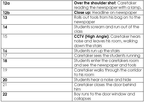
Storyboard ,Anime And Shotlist


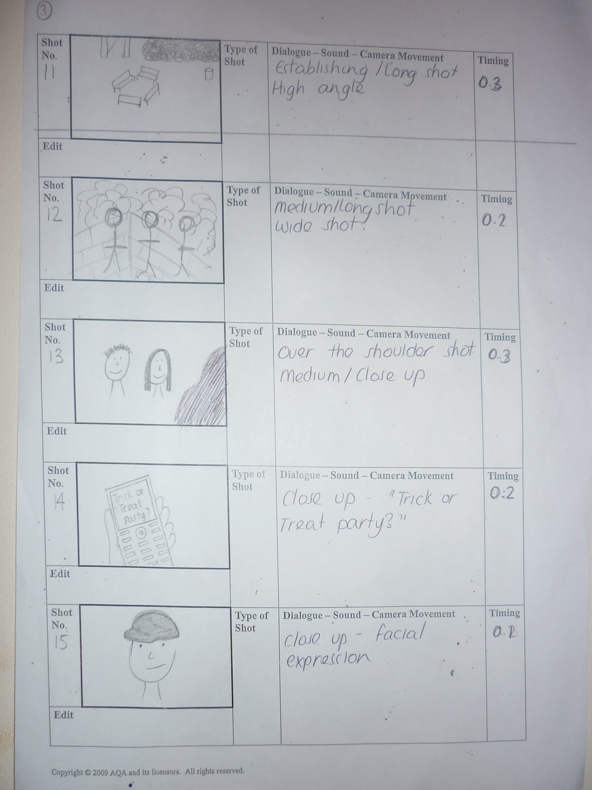


In this anime we decided not to use a script as we thought the film being silent would help build more tension and suspense. Also we thought the trailer would look more proffessional without peoples voices. Instead we decided to use a voiceover at the beggining where there is writing and music througout the other scenes. What is shown in the anime is that a ghost appears betwen the writing at the beginning, then a text is seen on a phone 'trick or treat' . This is to symbolise the idea of the rumour of whether the headmaster killing students, is true or not. Then four teenagers are seen who try to break into the school. You see them from a distance and closeups of the teenagers are seen too. There are quick cut shots of them running up the stairs and there's a close up of a door handle of a rooms they enter. These are shown to create the idea of suspense of the teenagers being in a school during the evening. Throughout the film you keep seeing the same sort of ghostly figure in the distance which represents the headmaster. The audience doesn't actually get to see if the rumour is true or not, so that there is still ambiguity and reason to come see the film. Also between shots, the production company is seen, the name of the film is seen and at the end the release date is
stated.
SHOT LIST

