Wednesday, 31 March 2010
Monday, 29 March 2010
Planning Photo's For Magazine Cover And Poster


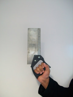
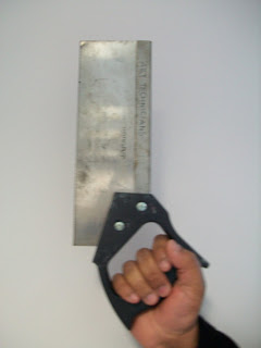
These were my planning photos at the beggining, I zoomed in and cropped photos when editing these. I took a range of different shots as i wanted to see which ones would look more frightening. However i found whilst editing the simpelest photos such as the one just above, was more useful as i used the lighting red from photoshop to be used on the phtograph.
Wednesday, 24 March 2010
Fonts that can be used on my Magazine Cover or Poster
Headings for Magazine cover- (Masthead)
 These were my first ideas for a magazine masthead, as i thought it should relate to theme of horror. However looking at more magazine covers relating to advertising a movie, they were more related to mastheads that had the idea of a film in it, so I cam up with other names.ie:
Film View
Take One
Film Camera Action
In the end I picked Film View as the masthead on my magazine.
Colour Schemes that can be used for my Magazine and Poster
A colour scheme is the choice of colours used in a design for a range of media. An example, the use of a white background with black text is an example of a basic color scheme in web design.
Colour schemes are used to create style and appeal. A basic colour scheme will use two colours’ that look appealing together. More advanced color schemes have three colors in combination, usually based around a single colour; for example, text with such colours as red, yellow, orange and light blue arranged together on a black background in a magazine article.
Colour schemes can also contain different shades of a single colour; for example, a colour scheme that mixes different shades of green, ranging from very light (almost white) to very dark.

A colour circle, based on red, yellow and blue, is traditional in the field of art. Sir Isaac Newton developed the first circular diagram of colours in 1666. Since then scientists and artists have studied and designed numerous variations of this concept. Differences of opinion about the validity of one format over another continue to provoke debate. In reality, any colour circle or colour wheel which presents a logically arranged sequence of pure hues has merit.

SECONDARY COLOURS: Green, orange and purple. These are the colours formed by mixing the primary colours.
TERTIARY COLOURS: Yellow-orange, red-orange, red-purple, blue-purple, blue-green and yellow-green.
These are the colours formed by mixing a primary and a secondary colour. That's why the hue is a two word name, such as blue-green, red-violet, and yellow-orange.
These are the colours formed by mixing a primary and a secondary colour. That's why the hue is a two word name, such as blue-green, red-violet, and yellow-orange.
Subscribe to:
Comments (Atom)


